Map & GPS Analysis
A complete geographic analysis system that transforms 10 years of personal GPS data into interactive maps, heatmaps, and visual insights.
Live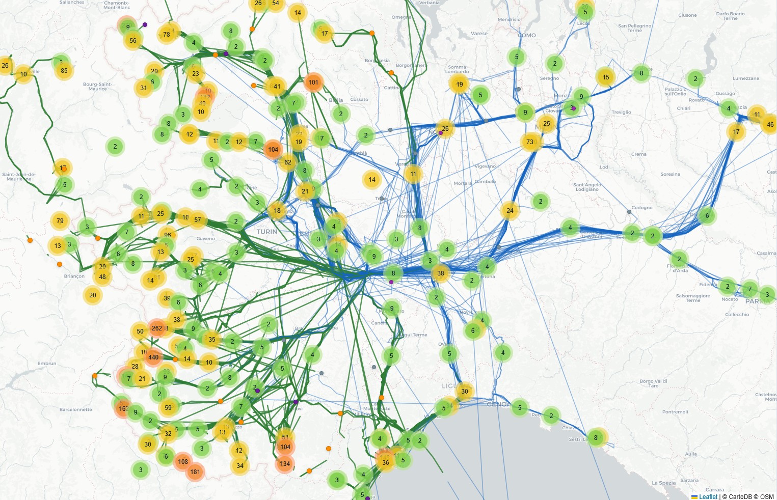
Since 2016, I've been collecting geolocation data through Google Timeline. I built a system that transforms raw JSON files into a structured database, interactive maps, and visual analysis.
The data
The database contains 19,193 visits over 3,403 days, 19,040 movements totaling 296,954 km traveled. 172,146 photos were analyzed, of which 14,983 have GPS coordinates. The data covers 12 countries, 10 Italian regions, and 37 provinces, with 11,841 hours of tracked movement from 2016 to 2026.
The pipeline
The processing flow follows 12 sequential steps: from parsing Google Takeout JSON to building the SQLite database, from extracting and clustering locations to enrichment with OSM Nominatim geocoding, from GPX track matching to EXIF photo analysis. Each step produces verifiable intermediate outputs and the system supports incremental processing.
The maps
The system generates interactive Leaflet maps with filters by year, location type, and geographic zone. The movement map shows 300 locations with 7,982 points connected by year-colored paths. The mountain map visualizes 1,610 alpine clusters with peaks, refuges, and GPS tracks. Each map supports drawing zones of interest for real-time data filtering.
Mountains in numbers
The alpine analysis automatically identifies mountain outings from GPS data. 3,236 position clusters, 31,056 peaks mapped from OpenStreetMap, 3,673 refuges, 1,483 via ferratas, and 154 bivouacs. The system associates photos and GPX tracks with each outing and generates structured YAML files for website integration.
Piedmont
With 18,009 visits out of 19,193 total, Piedmont dominates the map. Asti leads with 16,015 visits, followed by Turin (1,470) and Cuneo (382). The heatmap reveals patterns: the concentration in the Asti area, branches toward the alpine valleys of Cuneo and Turin provinces, and corridors toward Liguria and Lombardy.